Howler Head: accelerating the growth of a new challenger brand
Some campaigns can go to exciting and surprising places.
In 2022, WePlay was appointed by the whiskey brand Howler Head to launch its product in the US and UK with an integrated marketing strategy.
It was an intriguing proposition with a distinctive edge. Established in 2021, Howler Head is a high-quality Kentucky straight bourbon whiskey with a natural banana flavour. It is a challenger brand but also the official flavoured whiskey sponsor of another WePlay partner, the UFC.
Creative was going to be central to what we wanted to achieve. We needed visuals that cut through and messaging that landed with the target audience. But there were also some nuanced conversations to consider around positioning an alcohol product against a combat sport.
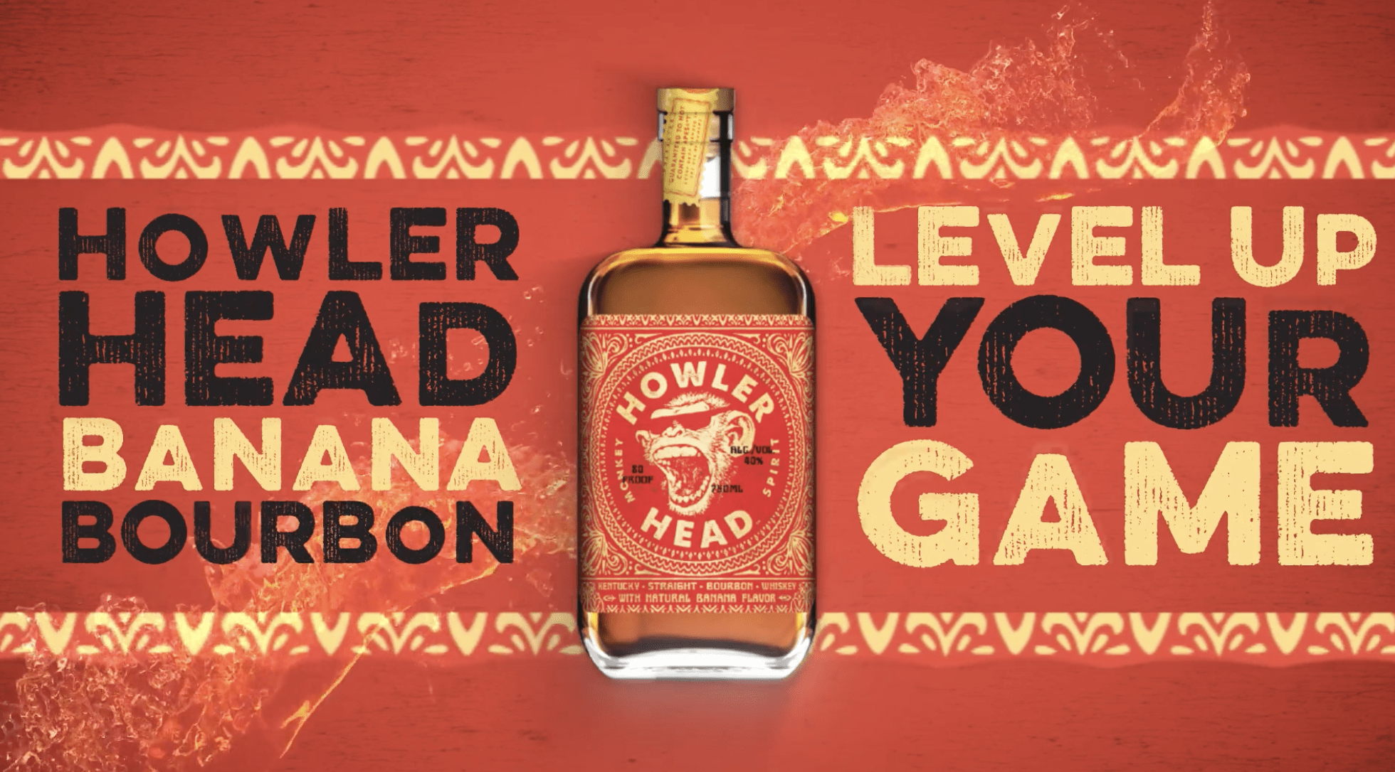
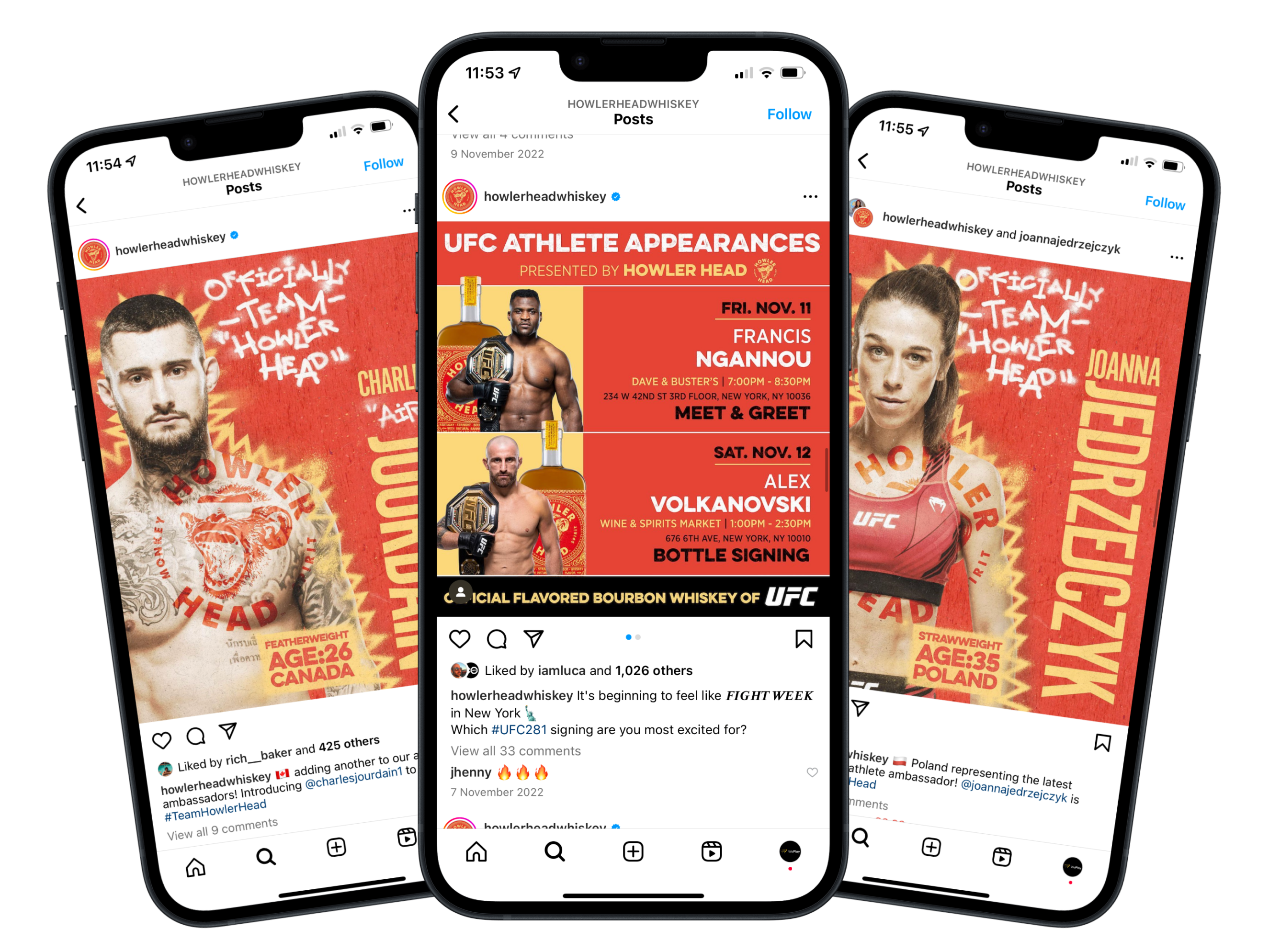
We built a campaign on playful, irreverent branding with bold typography, bespoke stylised graphics and striking communication. And it got Howler Head noticed: bottle sales rose and late last year, Campari Group agreed a $15 million investment for a 15% stake in the company, with global expansion on the horizon.
Identifying the audience
We established early on that the core prospective audience for Howler Head overlapped with that of the UFC.
Underneath that, there were two or three secondary related categories: from combat sports fans to followers of major American leagues like the NFL and the NBA, and young consumers interested in other entertainment culture like gaming.
That was a teaching point that took us into some important areas in our execution. For one thing, the partnership with the UFC gave us invaluable events to activate against and we made a choice to work towards the big numbered pay-per-view set-pieces, ramping up to UFC 281 at Madison Square Garden. We also made plans for local activations – notably in the UK for UFC London.
On top of that, the UFC sponsorship gave us access to related imagery and other rights like bottle signings and fighter appearances. Dana White, the UFC president, was another strong advocate and brought his own personality into the mix. All of this informed our thinking on how we could bring the brand to life.
The UFC and its fans are voracious. It is a sport that can be quite tribal – both in terms of fans’ commitment to individual fighters and their pride in that community. So we tried to create a brand that responded to this sentiment, summed up in the tagline: ‘Welcome to our jungle!’
At the same time, we wanted to draw on the challenger status of the brand and introduce elements the fans could own. We held a viewing party in London, with graffiti artists that created art around the venue, and produced content from that. We had a team on the ground to film around sponsored UFC events in Las Vegas and recorded vox pops with fans at bottle signings. The idea here was to build the identity around the audience and then escalate and expand it around the live cards.
Creative focus
As it was such a new brand, there was not an advanced visual language around Howler Head when we came in.
The core elements were there – we had fonts, logos and colours – but not much beyond that. We were starting in an area of uncertainty and developing the tone of voice and visual aesthetic through the partnership. We needed to assess how people would hear about Howler Head, what content would work in different settings, and what story was being told.
A lot of the assets were based around references to the UFC. We were able to feature some iconic imagery, like the octagon and the fighters, and introduce Howler Head branding into that arena context.
Alongside this, we amplified the personality and identity of Howler Head itself. The howler monkey logo always played a big part in what we did. We designed animated intro and outro stings and developed a laugh for that character. For the brand to really resonate, it had to speak for itself to new consumers.
A strong first impression
In the early stages, the overriding aim for any brand is that it gets seen and that its qualities can be properly communicated.
Howler Head managed to get on the radar not just of consumers but of a major drinks manufacturer, and that investment could now change the company’s trajectory. It might also take the brand itself in different directions, but we are proud of the progress we were able to deliver.
We’ve set some new parameters in terms of how the brand is executed, how it looks in settings like social and out of home. But it is also important, with a challenger brand, to give it room to grow further and evolve as it becomes more established.
Brands can shift a lot at this point in their lifespan. It was important for us to create something immediate, textured and tactile that was ready to make its presence felt. Over time, as it moves out from being an underground brand, you might expect it to become more elevated even as it retains its personality. It will still need to stand out from the competition, but in different environments.
That is a natural process – but a strong first impression can go a long way.
If you want to know how our Creative team can accelerate the growth of your new brand, contact us.


